As a senior designer on the Creative Marketing Team at Big Fish Games, I was heavily involved in the launch marketing for EverMerge. I worked closely with multiple art directors, Product Managers, and Product Marketing leads to develop the look and feel of the EverMerge brand for launch. We attempted several creative directions before landing on the current look and feel. I developed the Marketing Guardrails for this game and others to help the creative team in making assets for social marketing, paid channels, app store representation, and PR.
I led the development of the EverMerge Marketing Guardrails document, which contained all the important go-to information that the team needed. This included descriptions of tone and feel, unique selling points, design motifs, frames and templates, main characters, color palettes, fonts and font styles, and general rules. I also developed many of the design motifs such as the CTA buttons, badges, frames, text styles and created templates and visual examples for the other designers to use.
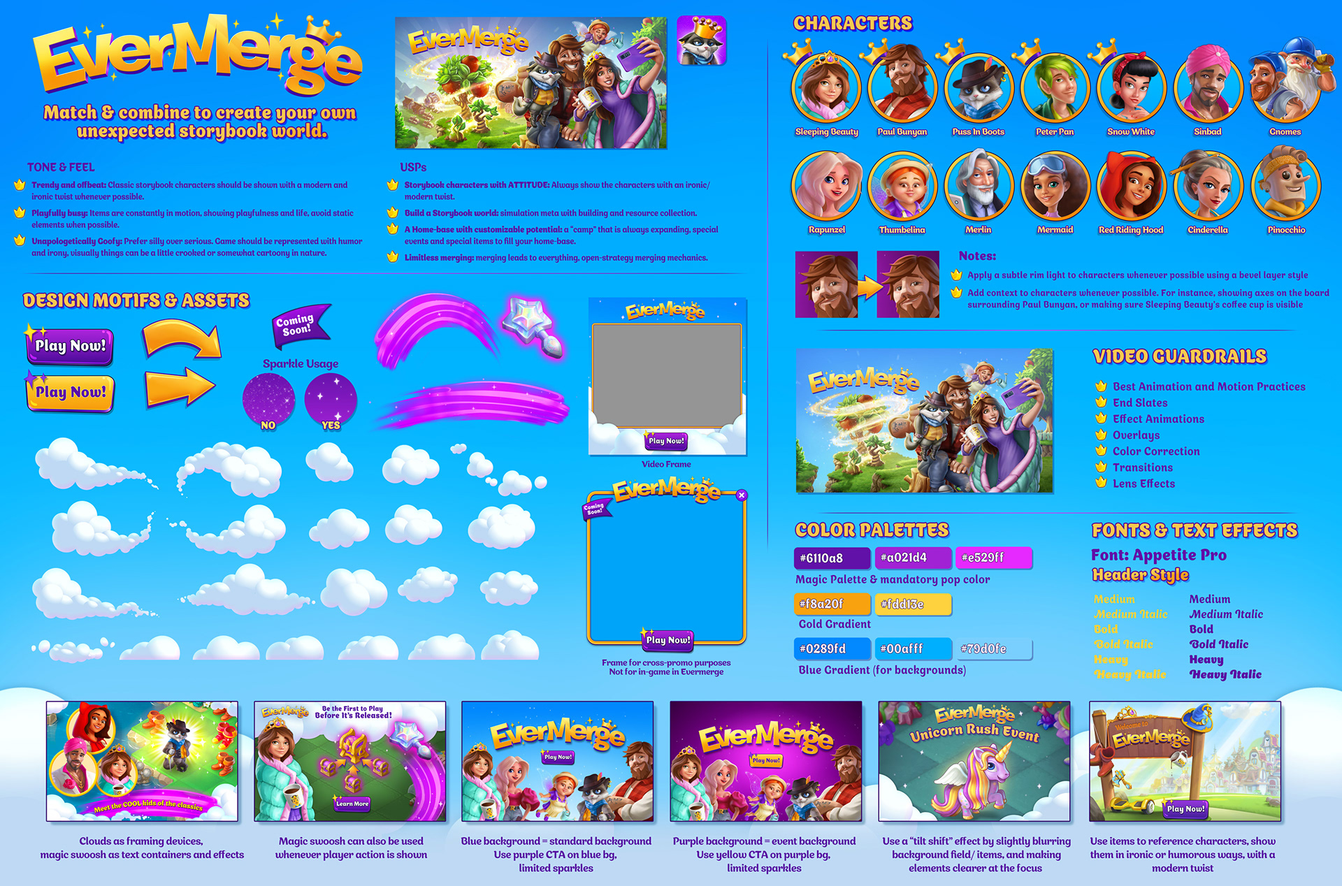
My role as senior designer was to help develop as well as organize all the information from multiple sources into one place to help ensure cohesive and high quality design across the team for the launch campaign. The Marketing Guardrails document was designed as a PDF that could answer frequently-asked questions at a glance, but also included built-in links to all of the assets that I uploaded and organized into a designated folder accessible by the team.
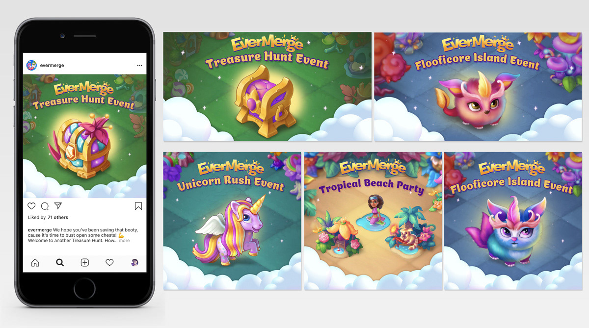
Social Assets
Here are just a few examples of social assets I made using the marketing guardrails. In addition to developing the overall look and feel, I was also an individual contributor on the team that created assets for marketing.
Concept Art & Item Design
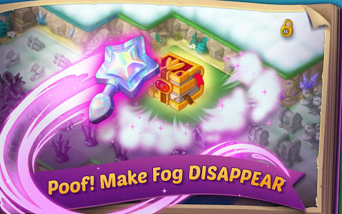
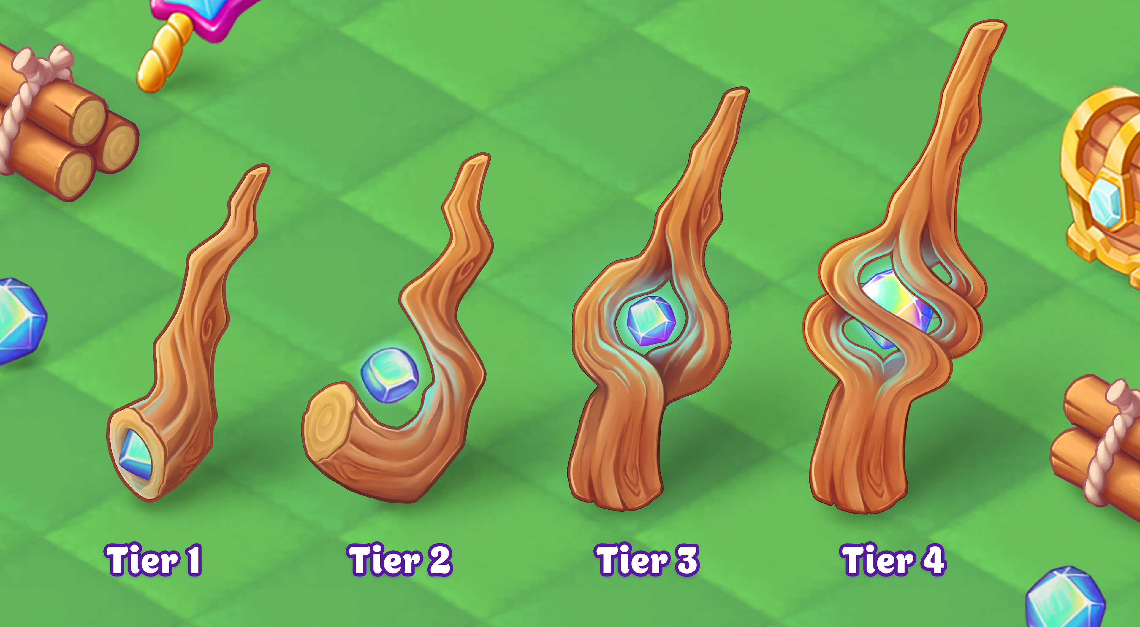
I also had the opportunity to explore the game art development side by designing and illustrating a new wand chain for the game, to be used in marketing and eventually pitched to the game developers.
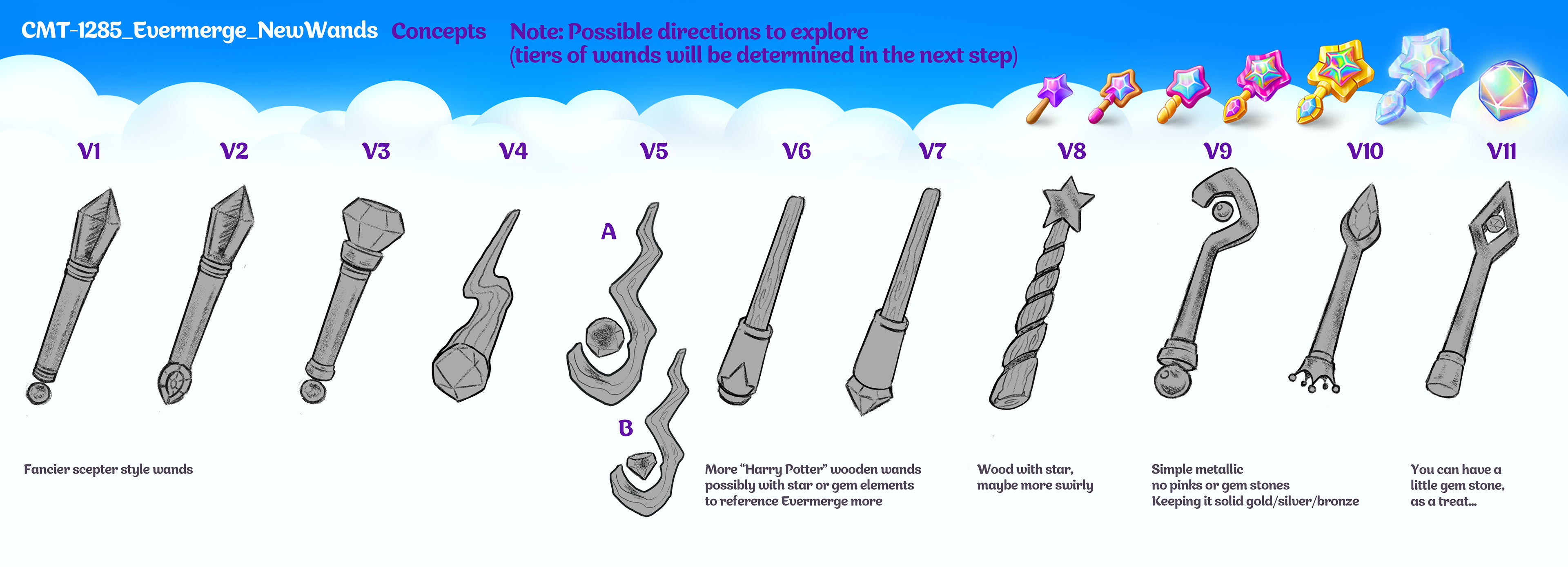
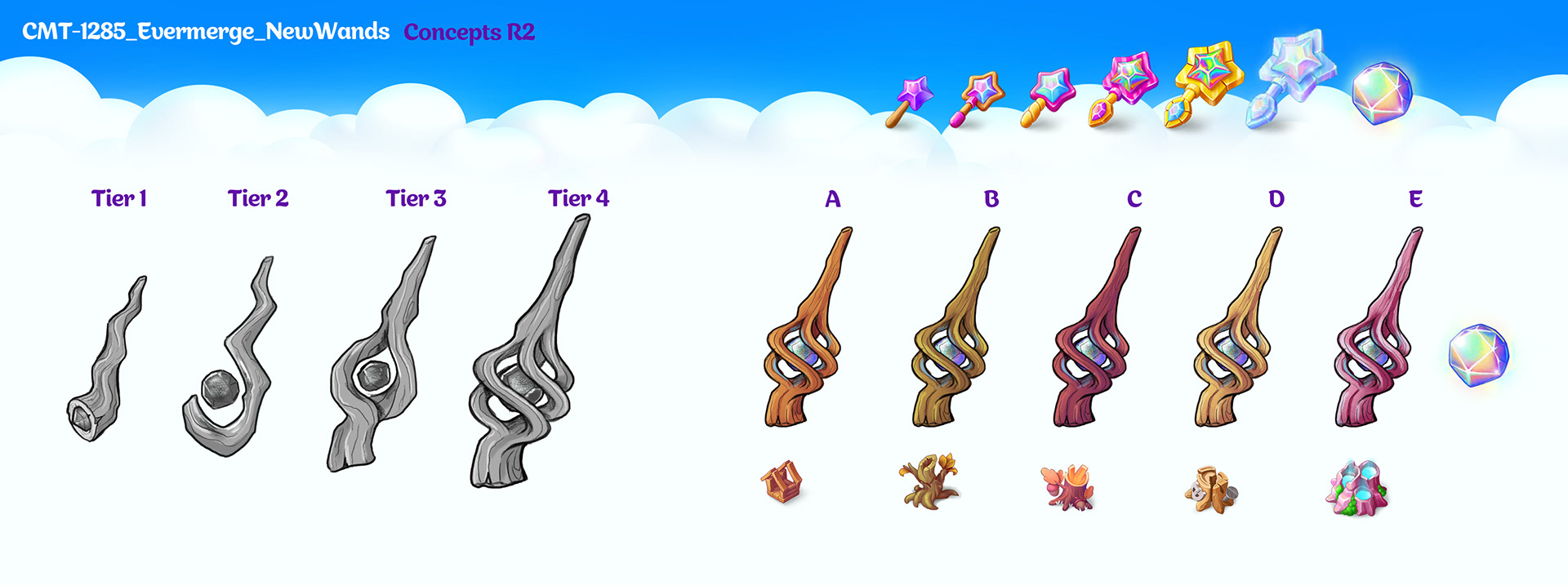
The client wanted something more mystical and less "princess," so I offered a number of sketched design directions and narrowed them down to direction V5, which I expanded into different "tiers," from most basic, to most advanced wand level. After design and color palettes were decided, I illustrated them to match the style of the other elements in the game, focusing on making them whimsical and magical.
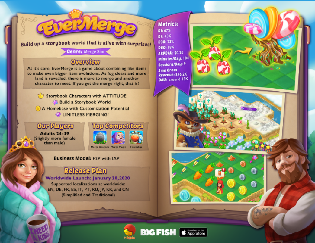
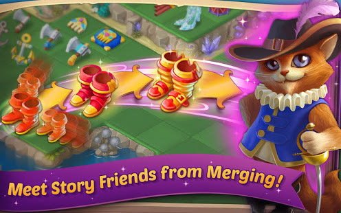
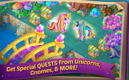
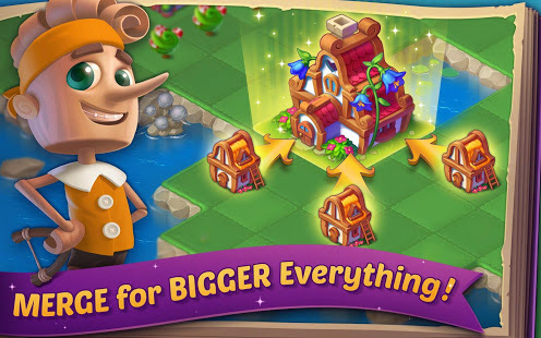
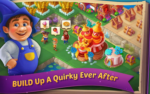
Beta Launch Assets & Direction
I also helped to develop the first direction for the look and feel of the EverMerge marketing, which had more of a storybook, fantasy tone. It later changed based on further testing and a shift in the game art and concept. Below are examples of the sell sheet and beta app screens for the game, before the shift in branding.