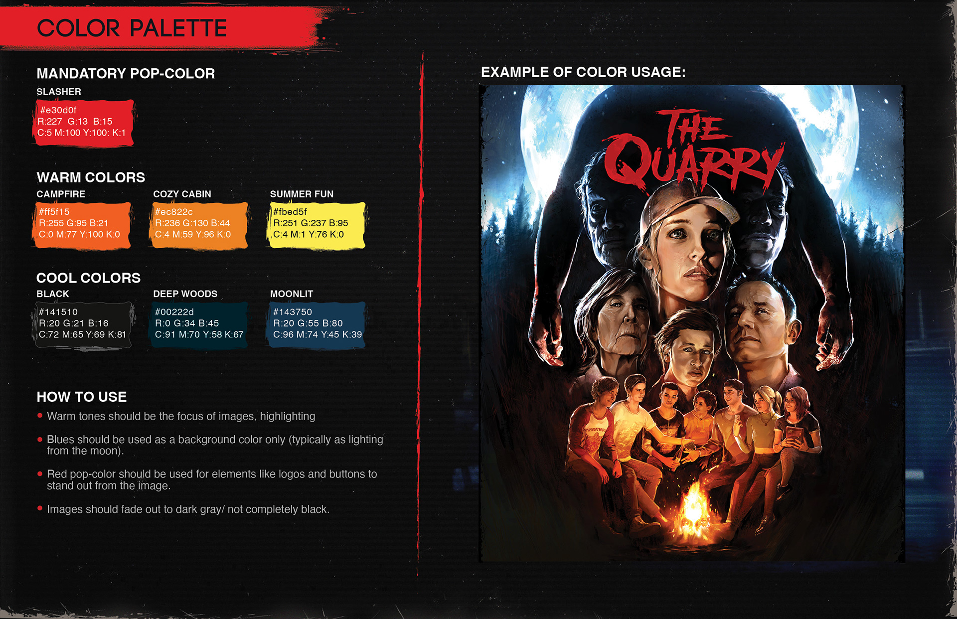
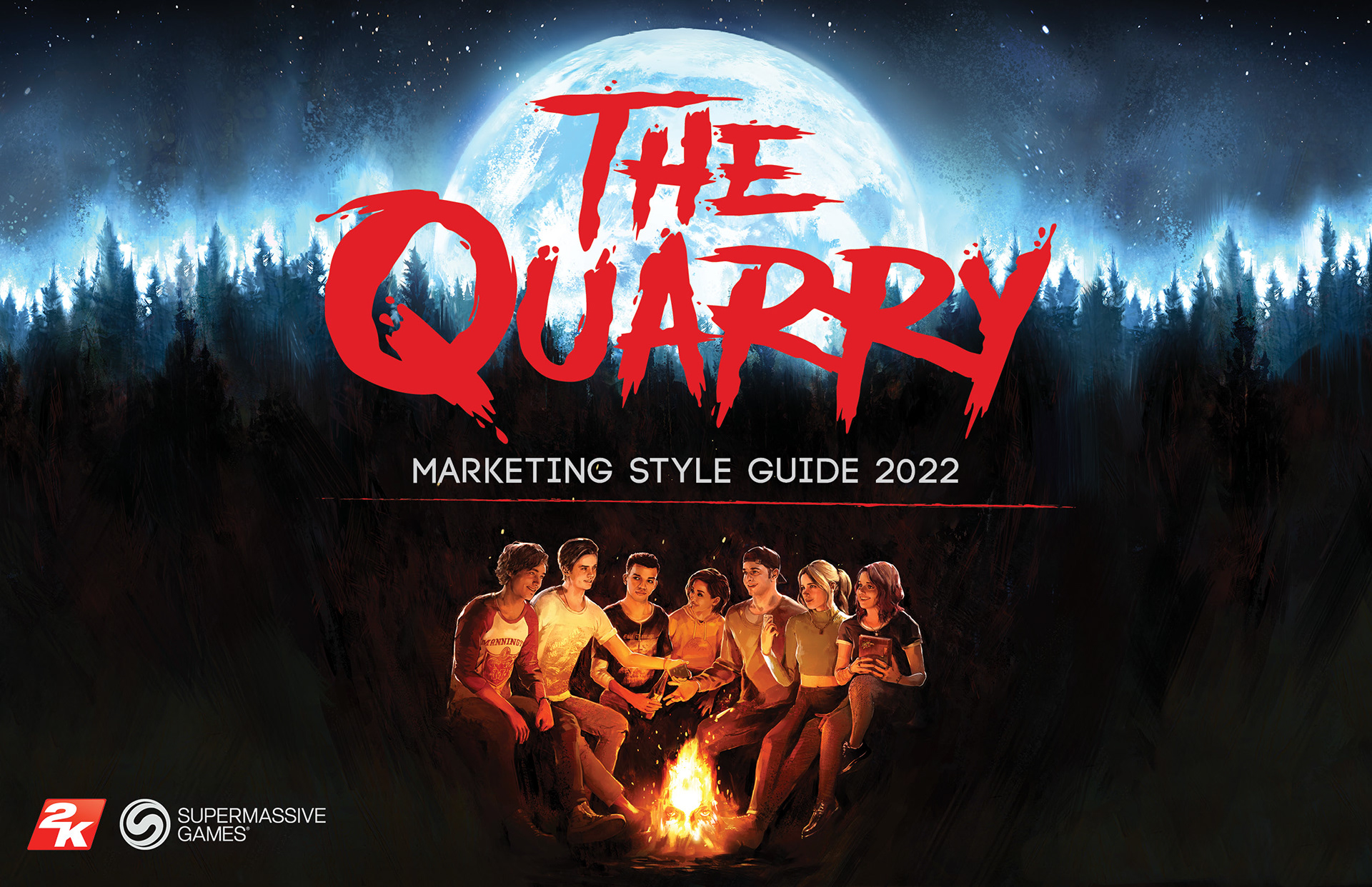
Style Guide and Look & Feel
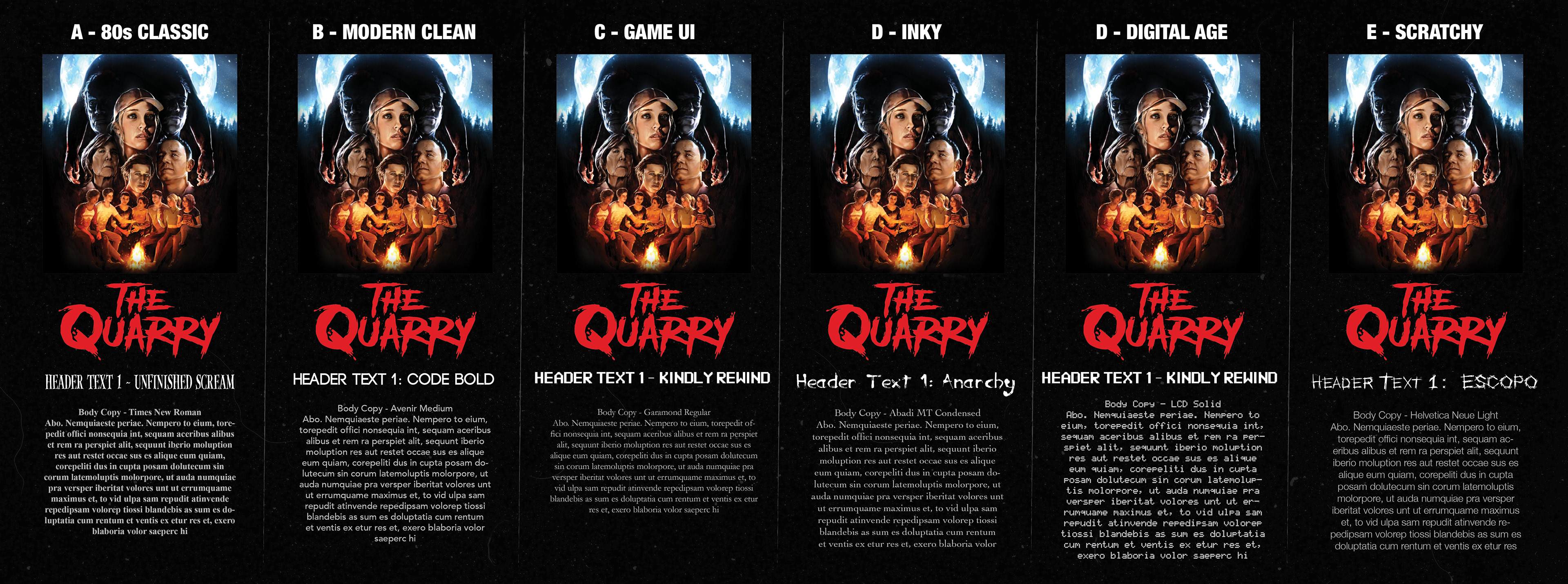
I was asked by 2K Games to help determine the look and feel for Supermassive Games' The Quarry marketing. Though the game is set in the current time, it makes use of many classic horror movie tropes. The marketing team wanted to take advantage of this and use a classic 80s slasher look for the marketing, relying on illustrative qualities, texture, dark atmosphere, and high contrast.
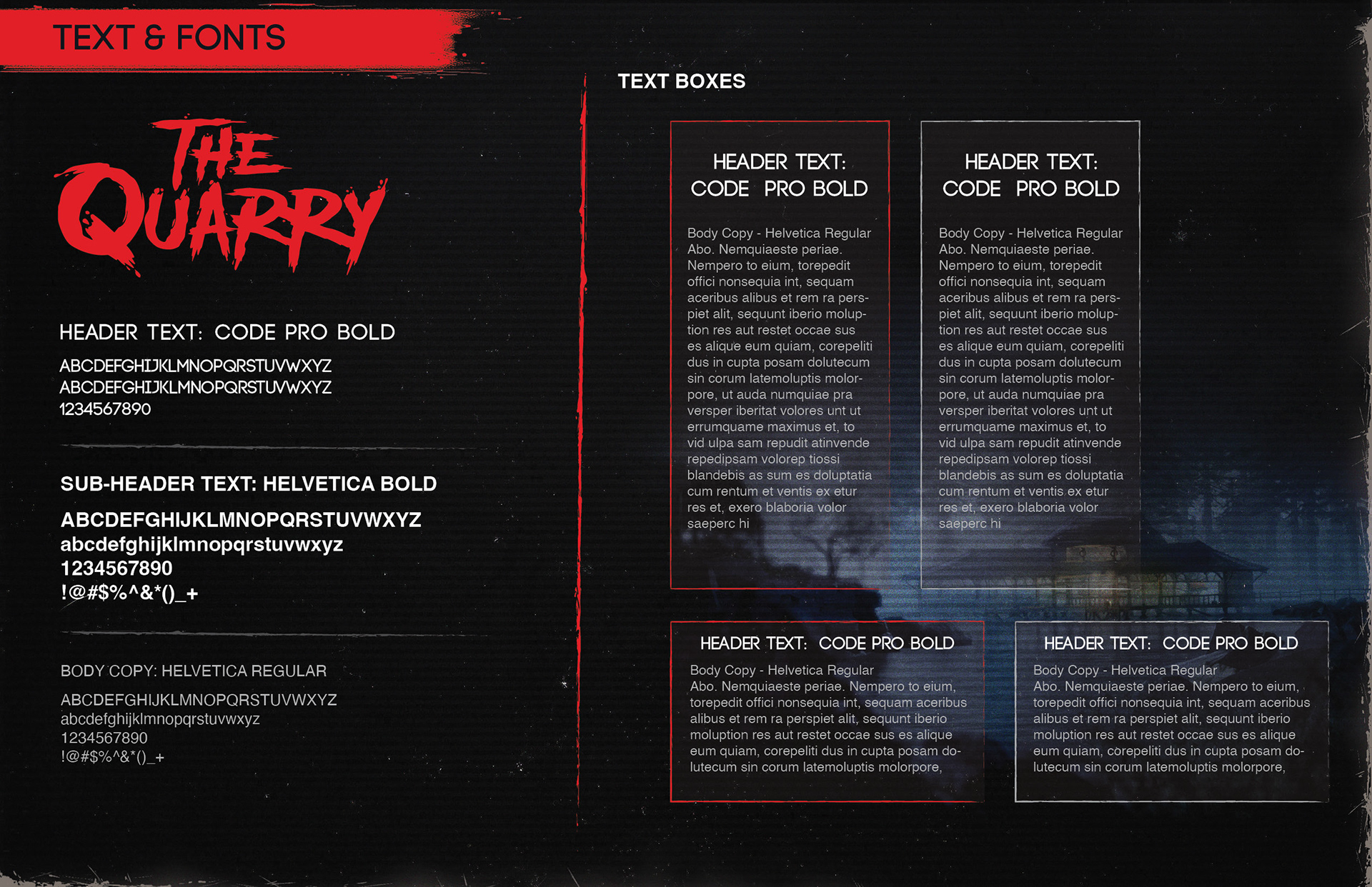
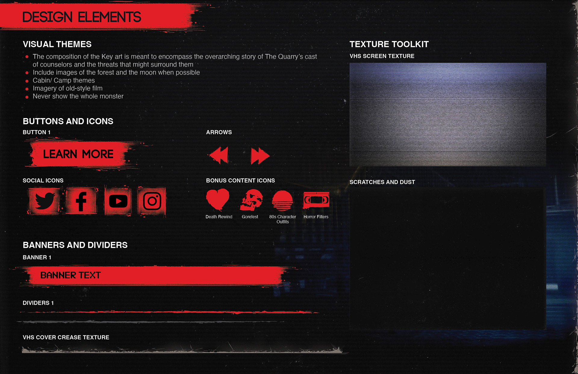
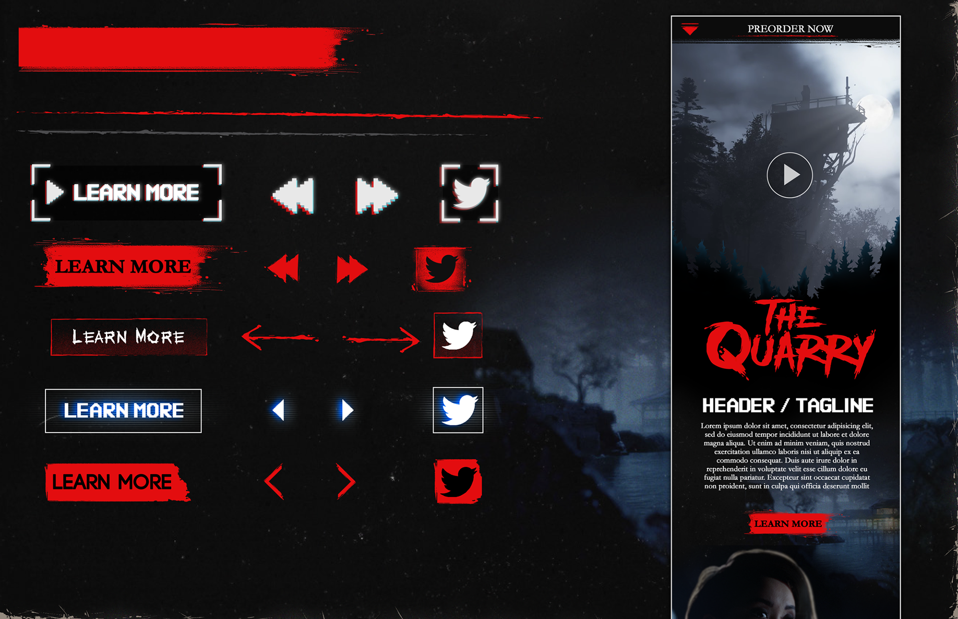
I researched the styles of 80s slasher classics, along with some modern revivals of the style like Stranger Things and used the provided key art as a launching point for creating design elements to accomplish the desired look and feel and build a full style guide document. I used a combination of design and illustrative elements to create things like buttons and banners, dividers, text containers, icons, textures, and more.
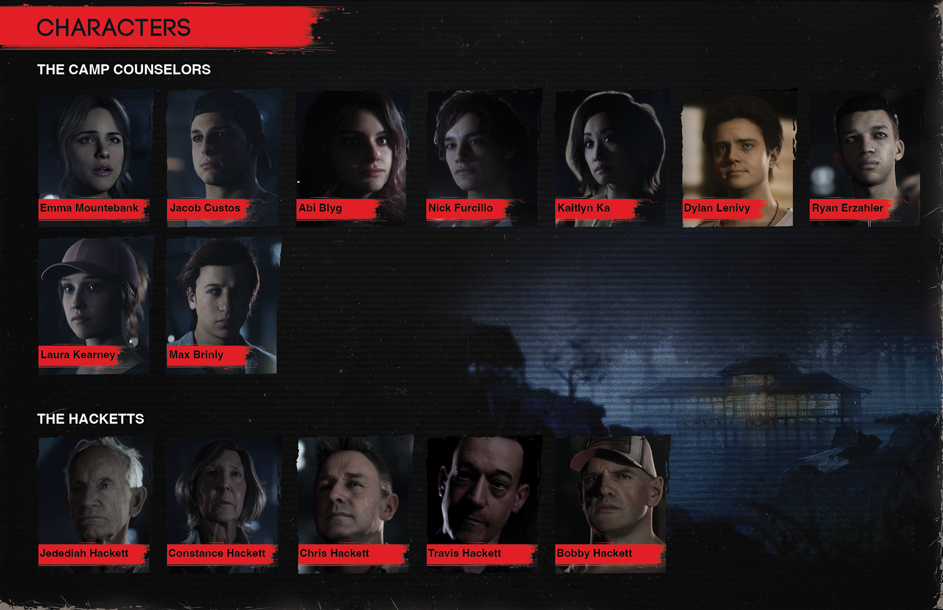
Below are a few pages from the style guide.
Process Images
I did several explorations of different styles and font combinations that could work for the desired direction and created several website mockups to show them in action and show some possible website designs.
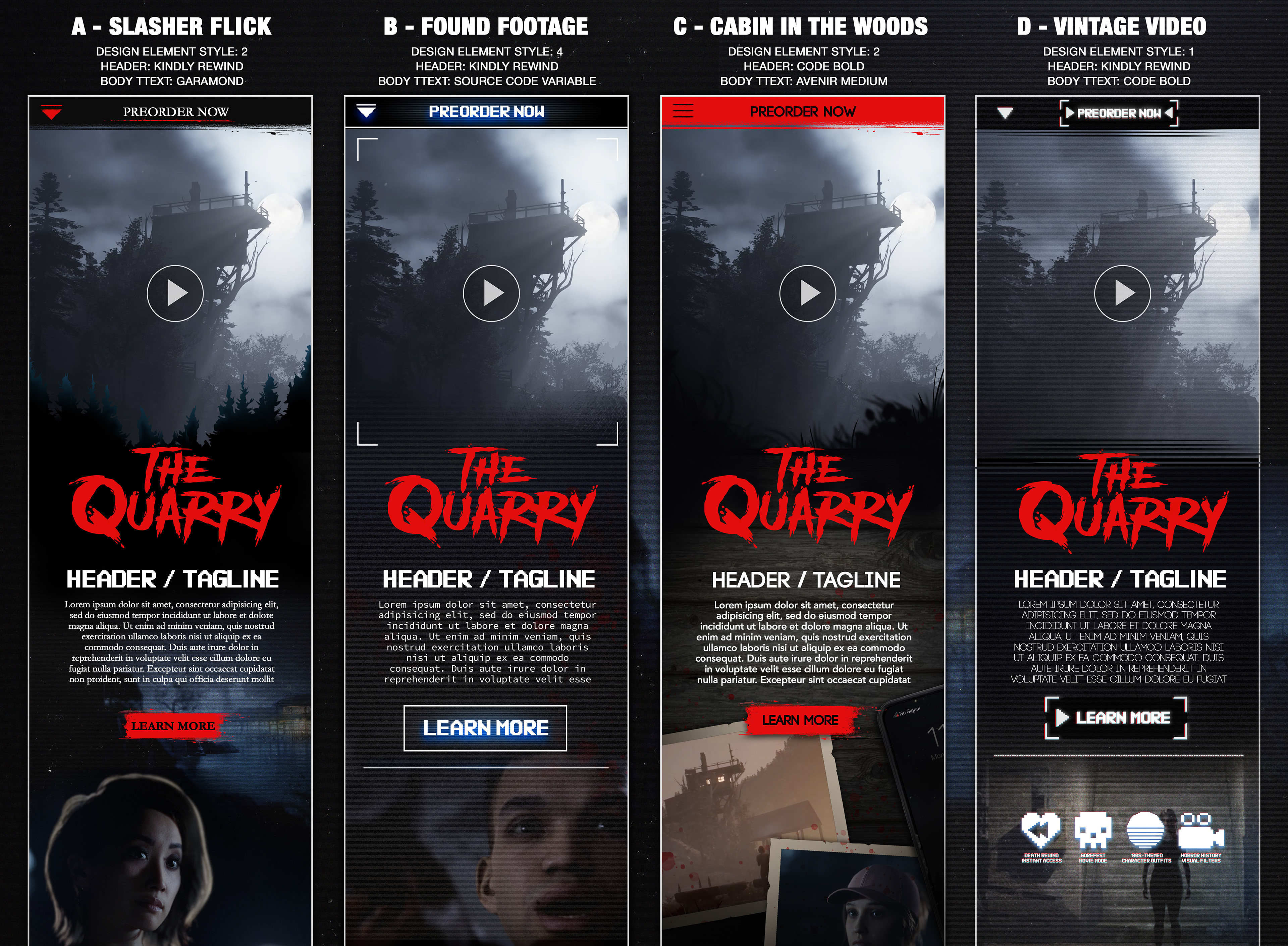
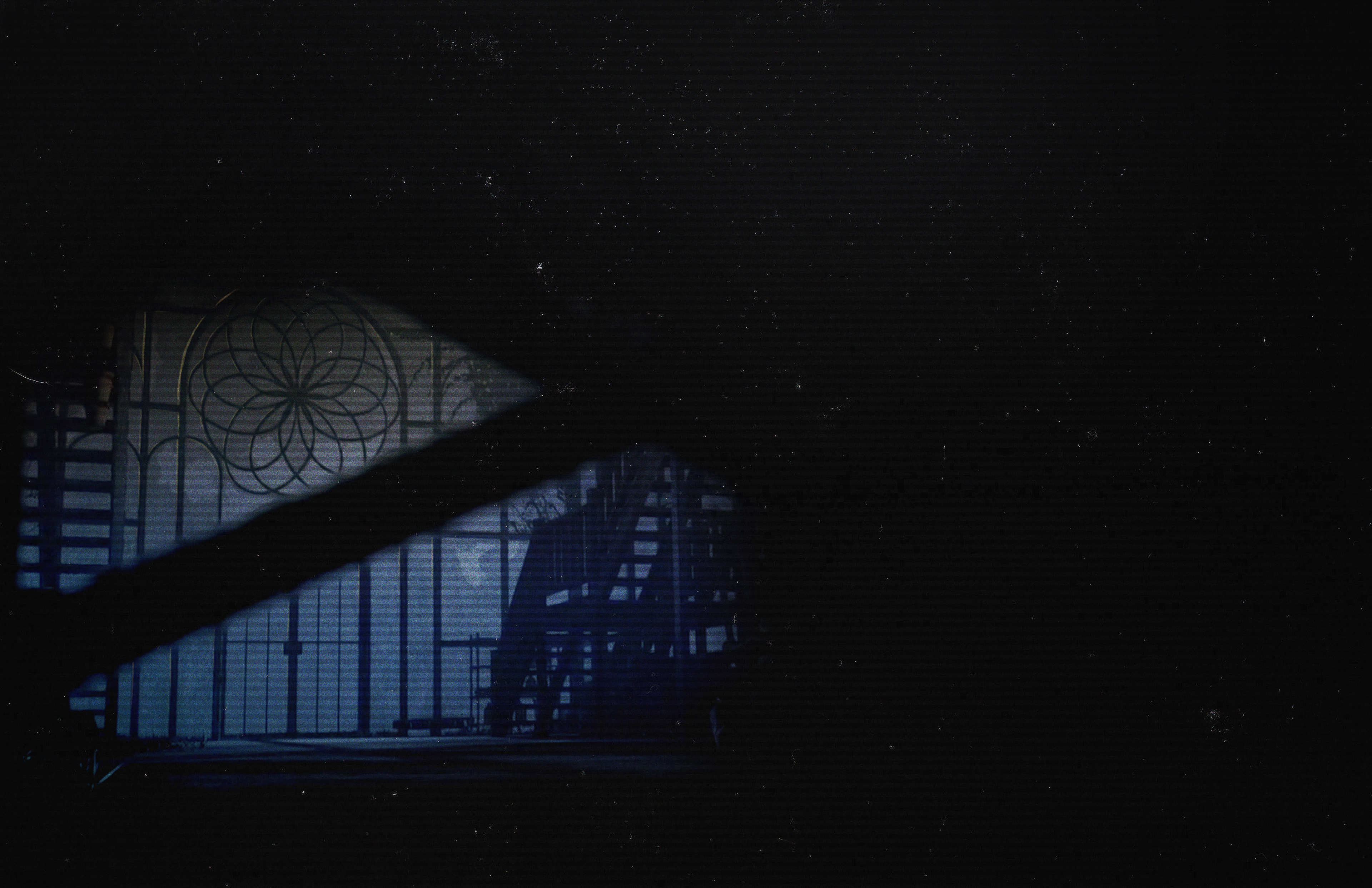
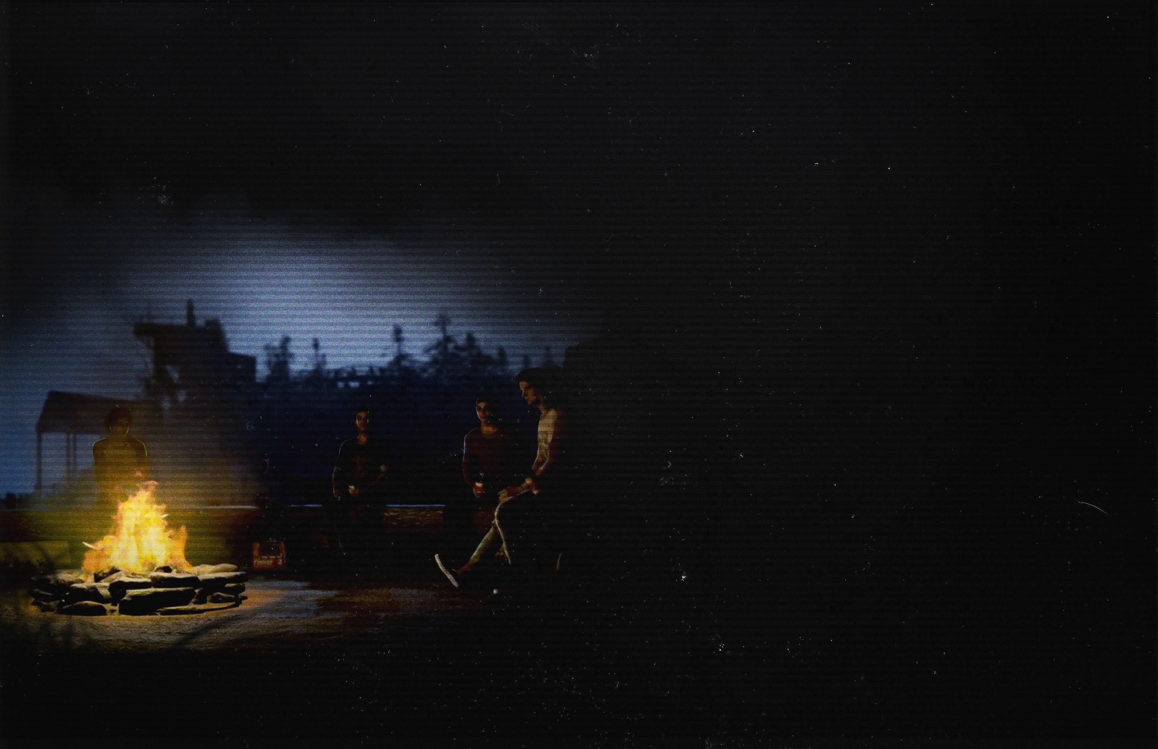
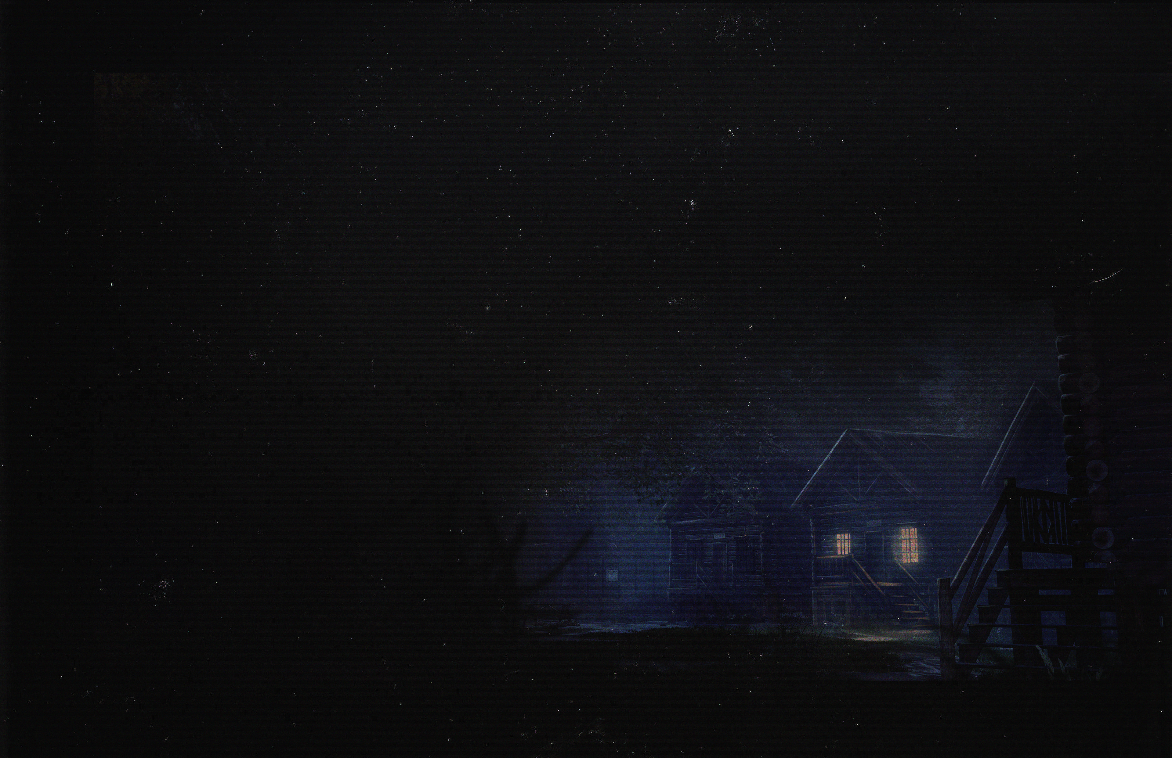
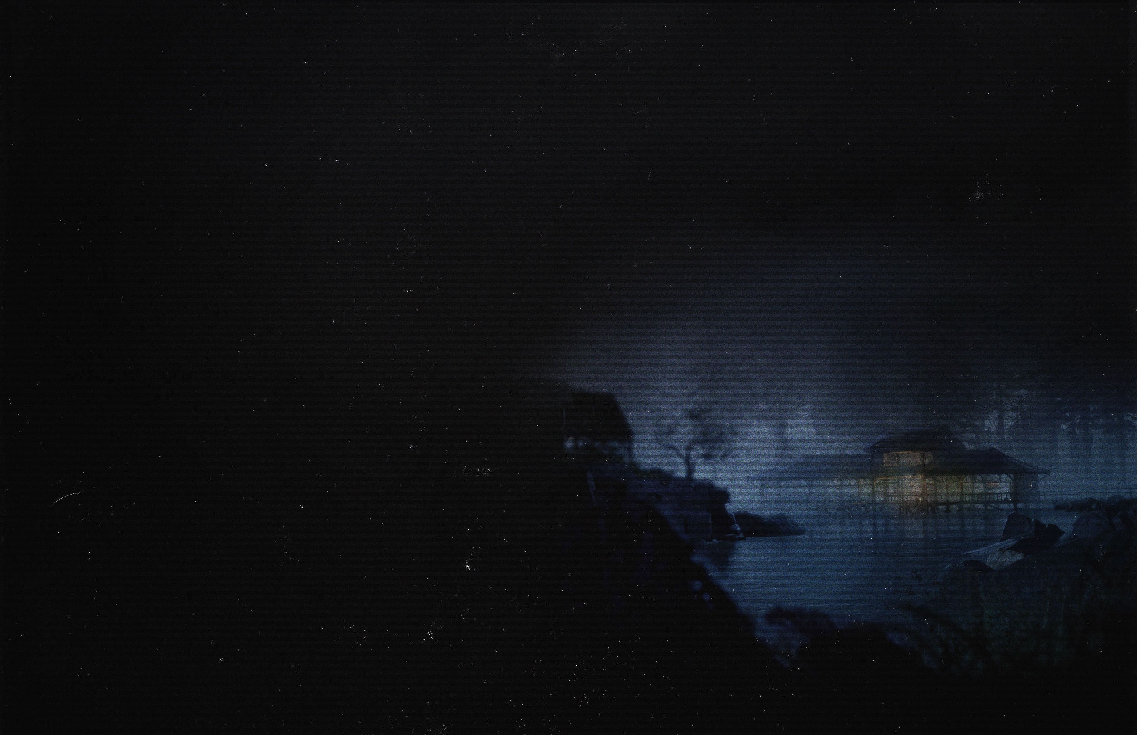
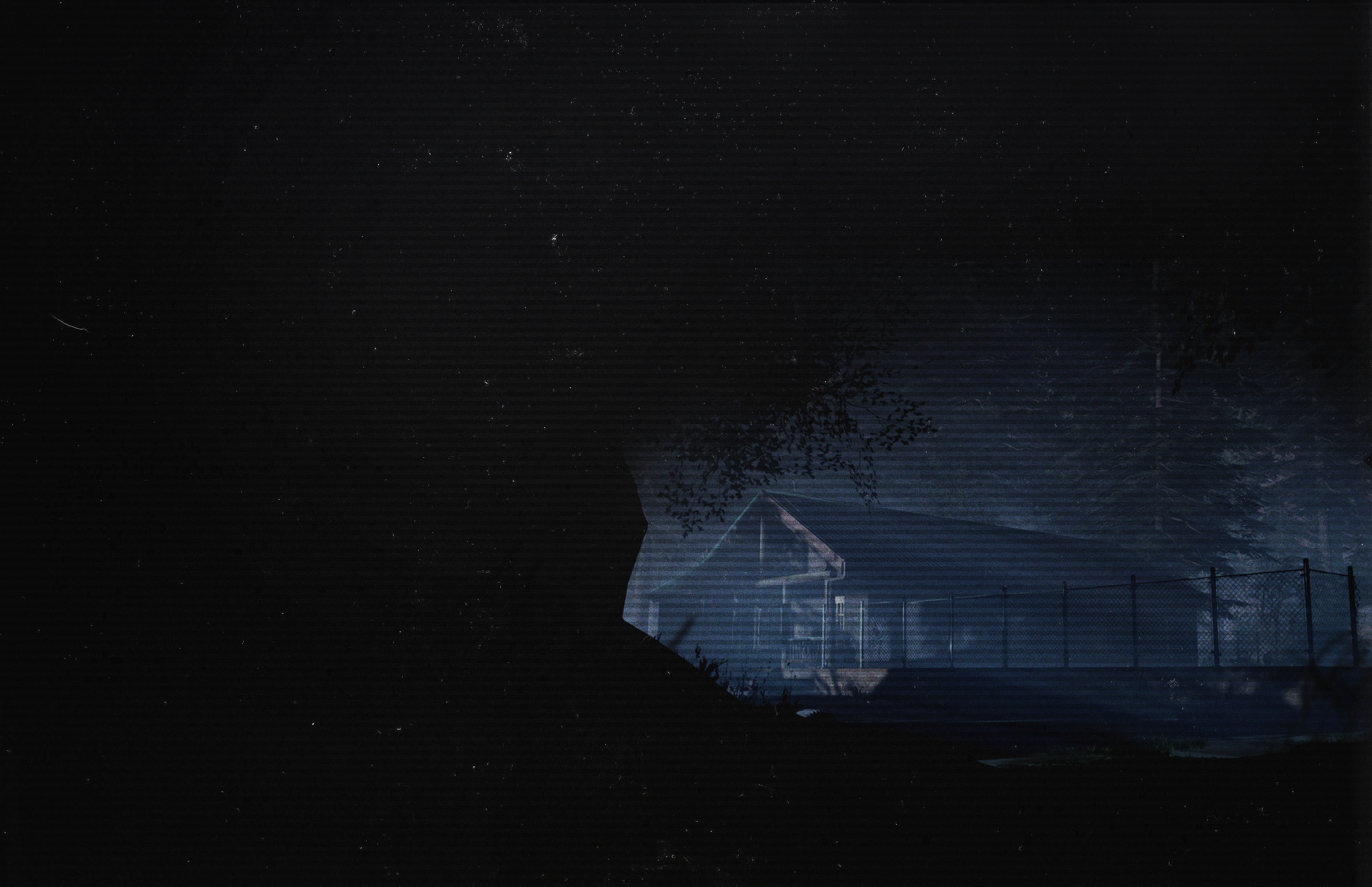
Background assets created from painted-over screenshots, used for various marketing, website, and style guide.